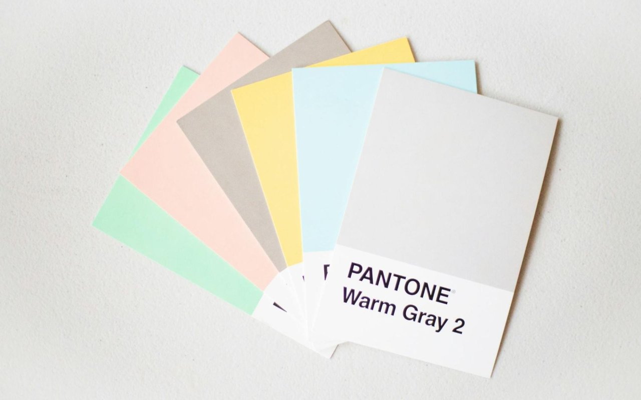
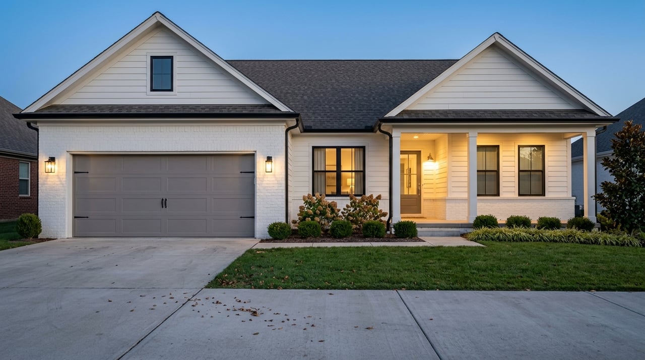
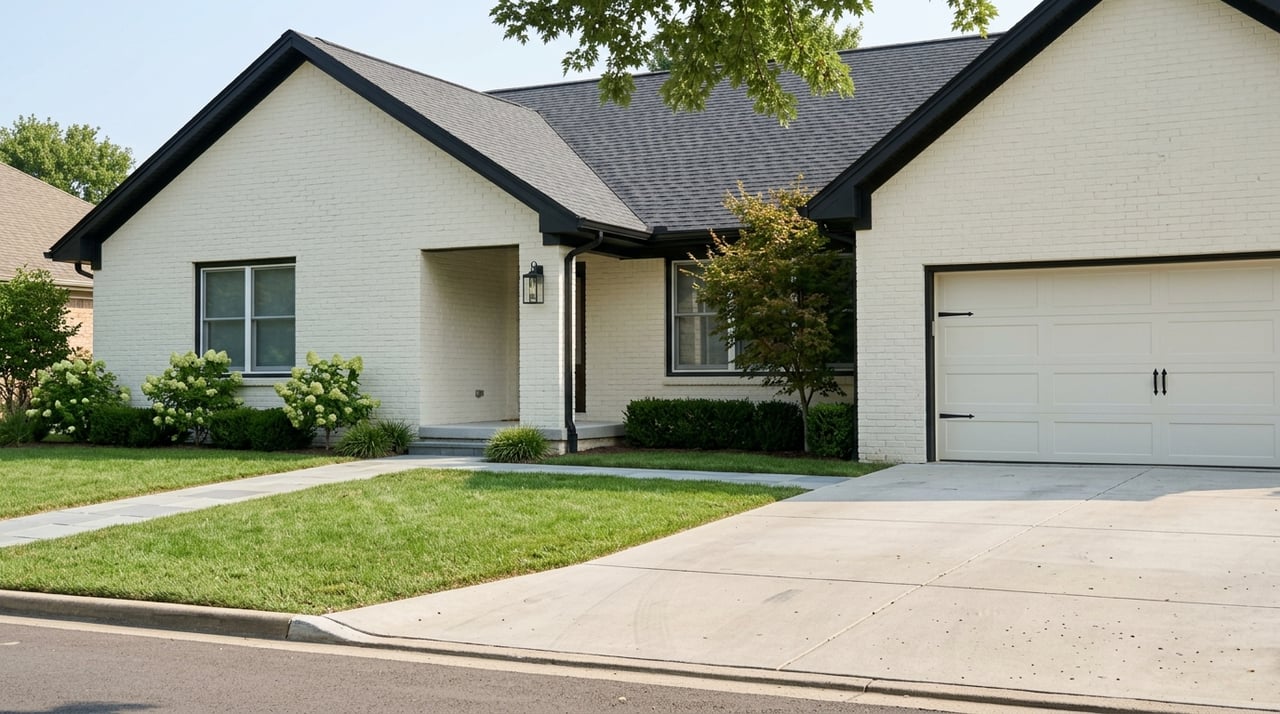
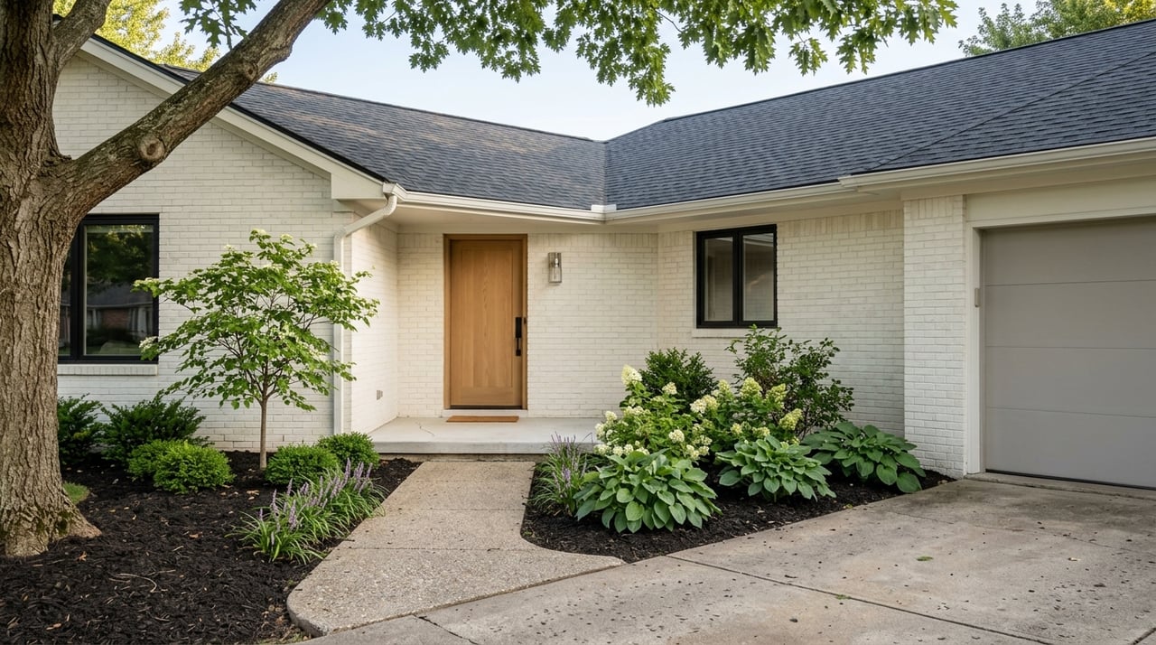
Choosing the right paint color can do more than change the look of your home—it can change the feel. Color influences our mood, energy levels, and even our appetite. Whether you're preparing your home for sale or planning a fresh update, understanding the science of color can help you create the perfect ambiance in every room.
As a Knoxville real estate expert,
Jennifer Whicker knows how much color can influence a buyer’s first impression—and how the right tones can enhance your living space. Let’s explore how to use color effectively, room by room.
The Psychology Behind Color
Before diving into specific rooms, it's helpful to understand how different colors affect our mindset:
-
Warm colors (like red, orange, and yellow) evoke energy, warmth, and creativity. They can stimulate conversation and appetite but may feel overwhelming if overused.
-
Cool colors (like blue, green, and purple) are calming, soothing, and help create a sense of peace and space.
-
Neutrals (white, beige, gray, and taupe) offer flexibility and timeless appeal. They provide a clean backdrop and pair well with accent colors.
-
Bold tones (like black, navy, or emerald) can create drama, sophistication, and focus when used intentionally.
Now that we’ve got the basics let’s walk through each room in your home and explore the best paint tones based on science and design principles.
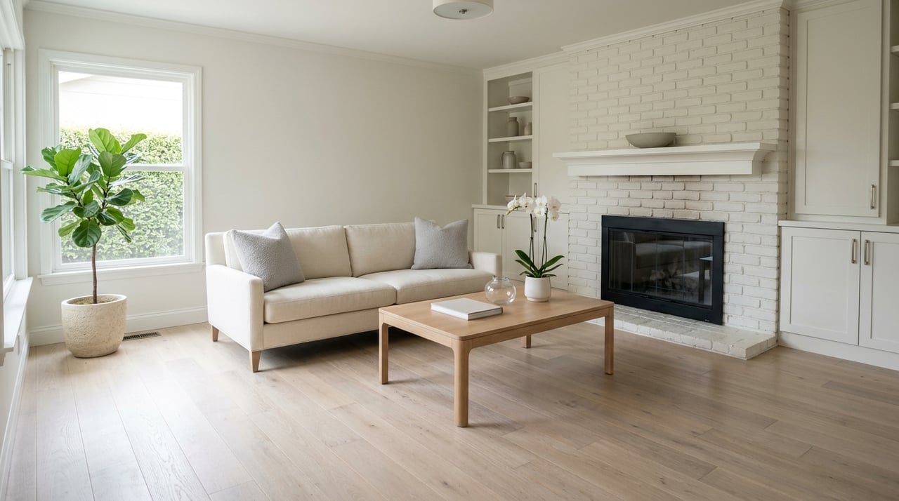
Living Room: Invite Comfort and Conversation
The living room is a hub for relaxation and socializing, so it’s important to strike a balance between comfort and style.
Best Colors:
-
Warm neutrals like soft beige, taupe, or greige create a cozy and welcoming space.
-
Earthy tones like olive green or terracotta bring nature indoors and foster warmth.
-
Soft blues promote calm and sophistication, especially in well-lit rooms.
Pro Tip: Add visual interest with an accent wall or layered textures (rugs, pillows, throws) in complementary colors.
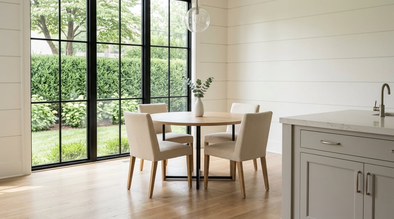
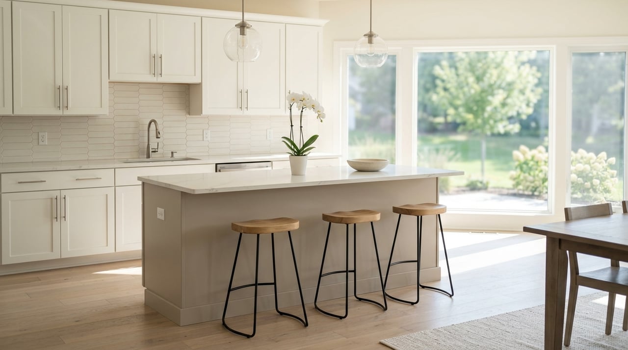
Kitchen: Energize and Stimulate
Kitchens are high-traffic, high-energy spaces. Color can play a big role in stimulating both the appetite and conversation.
Best Colors:
-
Warm whites and creams create a clean and timeless look, especially paired with natural wood or stone.
-
Sunny yellows and muted greens inspire creativity and freshness.
-
Slate blue or navy can add a touch of elegance when paired with brass or gold hardware.
Avoid: Harsh reds, which can feel overpowering in a small space or amplify stress in a busy kitchen.
Dining Room: Encourage Gathering
Dining rooms benefit from rich, warm tones that make the space feel intimate and inviting.
Best Colors:
-
Deep reds and burgundy are traditional favorites for their appetite-enhancing effects.
-
Charcoal gray or deep navy creates a moody, elegant dining experience.
-
Warm metallics like bronze or gold accents elevate the entire aesthetic.
Style Tip: Use semi-gloss or satin finishes to reflect light and add depth to darker tones.
Bedroom: Create a Sanctuary
Your bedroom should feel like a personal retreat. The right paint color can help reduce stress and promote restful sleep.
Best Colors:
-
Soft blues and dusty greens are scientifically proven to lower blood pressure and heart rate.
-
Lavender or lilac brings subtle serenity and works well with both modern and traditional décor.
-
Creamy neutrals are ideal if you prefer a minimalist, hotel-like aesthetic.
Design Tip: Avoid bold or bright tones in bedrooms—they can be too stimulating for winding down at night.
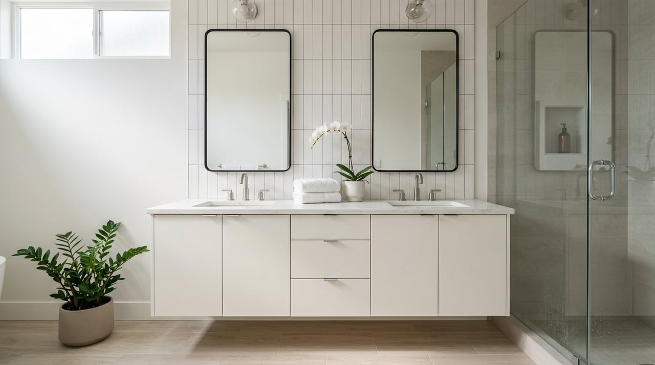
Bathroom: Refresh and Revive
Bathrooms should feel clean, fresh, and bright. The right color can make a small space feel larger or turn an ordinary bathroom into a spa-like escape.
Best Colors:
-
Crisp whites with cool undertones evoke cleanliness and clarity.
-
Sky blue or aqua can be invigorating and remind us of water and wellness.
-
Soft greys paired with white trim offer a modern and timeless look.
Tip for Sellers: A fresh coat of white or light gray paint can instantly update an older bathroom and appeal to more buyers.
Home Office: Focus and Functionality
With more people working from home than ever before, a well-designed office space is key. Color can influence productivity and creativity.
Best Colors:
-
Cool blues and muted greens promote focus and reduce eye strain.
-
Soft terracotta or warm taupe can add energy without feeling distracting.
-
Off-white with charcoal or navy accents blends professionalism with modern style.
Productivity Boost: Consider painting a single wall a bold, rich tone like emerald or navy to add depth and boost visual interest during video calls.
Kids’ Rooms: Playful Yet Practical
Kids' spaces should be fun, imaginative, and adaptable as they grow. It’s tempting to go wild with color, but balance is important.
Best Colors:
-
Pastels like mint green, soft pink, or baby blue are calming and flexible.
-
Bold primaries (used sparingly) can stimulate creativity in play areas.
-
Neutral backdrops allow for ever-changing décor and colorful accessories.
Growth Tip: Use peel-and-stick wallpaper or chalkboard paint on one wall so the space evolves with your child.
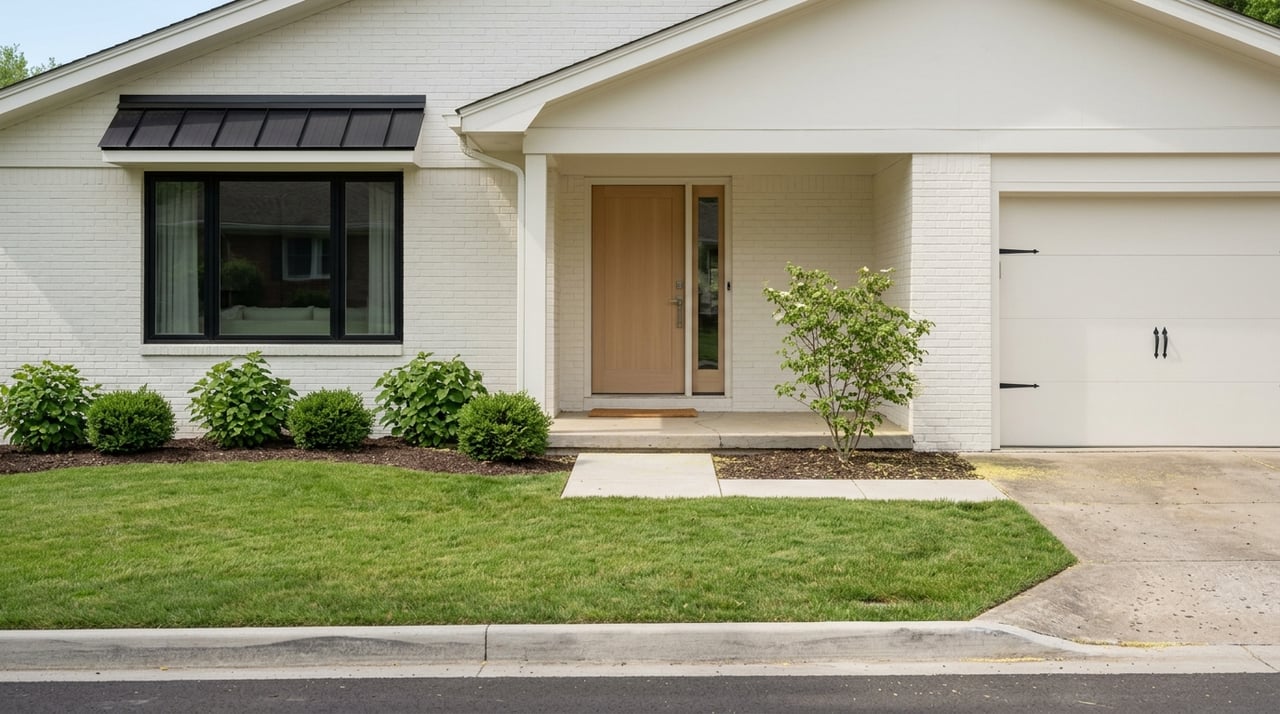
Hallways and Entryways: Set the Tone
Often overlooked, your hallway or entry sets the first impression and connects your entire home.
Best Colors:
-
Warm grays and light taupe offer neutrality while masking scuffs and wear.
-
Soft blush or muted sage adds subtle personality without overwhelming.
-
Charcoal or deep blue can create a dramatic entrance if space and light allow.
Light Hack: Lighter colors can help narrow or windowless hallways feel wider and more open.
Final Color Tips
-
Test before you commit. Always test samples on your wall under different lighting conditions.
-
Don’t forget finishes. Flat finishes hide flaws but are harder to clean. Satin or eggshell is ideal for most interior walls.
-
Coordinate with furniture. Choose tones that complement your existing furniture, flooring, and artwork for a cohesive look.
-
Let Knoxville inspire you. From Smoky Mountain greens to river blues and Appalachian sunset tones, nature can be your perfect palette.
Ready to Transform Your Space?
Choosing the right paint colors beautifies your home and boosts its appeal, value, and livability. Whether refreshing your home before listing it or making it your forever space, working with an expert can make all the difference.
Need guidance on choosing colors that work for your Knoxville home?
Jennifer Whicker offers personalized advice, market insight, and trusted vendor connections to help you create a space that truly shines.
Visit JenniferWhicker.com to schedule your free consultation or connect today!